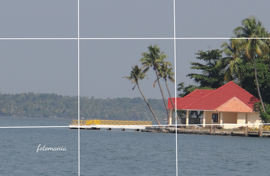
The Ultimate Guide to Rule of Thirds
The rule of thirds is one of the first composition tools photographers learn, and for good reason: it gives you a simple way to make images feel more balanced, intentional, and easy to look at.
It is not a law. Your camera will not reject a centered portrait, and a landscape will not fail because the horizon sits in the middle. Think of the rule of thirds as a reliable starting point—especially when you are looking at a busy scene and need to decide where the important stuff should go.
Once you understand how it works, you can use it quickly in street photography, portraits, landscapes, food photos, and even smartphone shots. More importantly, you will know when breaking it makes sense.
What Is the Rule of Thirds?
Imagine placing two evenly spaced vertical lines and two evenly spaced horizontal lines over your frame. This creates a grid with nine equal rectangles.
The rule of thirds suggests placing important elements along those lines or near the four points where they intersect. Those intersections are often called power points.
Most cameras and phone camera apps can display this grid in live view. Turn it on. It is one of the most useful visual aids available, and it costs nothing.
- Use the horizontal lines to position horizons, eyes, tabletops, or shorelines.
- Use the vertical lines for people, trees, buildings, roads, or other strong subjects.
- Use intersection points for a face, an animal’s eye, a flower, the moon, or a small subject in a wider scene.
The basic idea is to avoid placing every important thing directly in the center by default. Off-center placement often creates a little visual movement and leaves room for the viewer’s eye to travel through the frame.
Why It Works So Well
A centered subject can feel stable, formal, and direct. That can be great—but it can also feel static. Moving the subject slightly to one side introduces a relationship between the subject and the surrounding space.
Say you photograph a person looking to the right. Place them on the left third of the frame, then leave more room in front of their face. That empty area becomes meaningful. It gives their gaze somewhere to go.
The same applies to moving subjects. A cyclist, dog, runner, or car usually looks more natural when there is space ahead of them rather than behind them. This is often called lead room or look space.
How to Use the Rule of Thirds in Your Camera
Before worrying about precise placement, enable the grid display on your camera or phone. On many devices, it is found in the camera settings under “Grid,” “Composition,” or “Guides.”
Then use this simple process when composing a shot:
- Identify the main subject. Ask yourself what the viewer should notice first.
- Choose an appropriate line or intersection. A person may sit on a vertical third; a horizon may sit on a horizontal third.
- Check the empty space. Does it support the subject, or does it contain distractions?
- Look at the frame edges. Remove bright objects, cut-off limbs, and random clutter where possible.
- Take a second version. Shoot one image using the grid, then one centered or tighter. Compare them later.
That last step matters. Composition is not about blindly following a diagram. It is about learning how different framing choices change the feeling of an image.
Rule of Thirds Examples in Different Types of Photography
Landscape Photography
Landscapes are where the rule of thirds is most obvious. Instead of splitting the frame into equal halves with the horizon, place it near the upper or lower horizontal line.
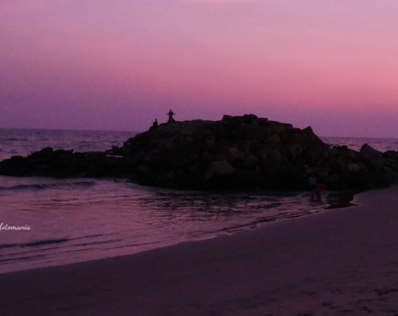
If the sky is dramatic—storm clouds, sunrise color, a glowing moon—place the horizon on the lower third. Give the sky roughly two-thirds of the image.
If the foreground is more interesting—a field of wildflowers, textured rocks, a winding river, or patterns in sand—place the horizon on the upper third. Let the foreground do more of the work.
For a lone tree, mountain peak, lighthouse, or cabin, try placing it near a vertical third or one of the intersections. Then look for a leading line, such as a path or shoreline, that guides the eye toward it.
Portrait Photography
In portraits, the eyes are usually the strongest visual anchor. Positioning the eyes close to the upper horizontal third often feels natural, particularly in head-and-shoulders portraits.
You do not need to place both eyes exactly on a line. The point is to avoid accidentally leaving too much empty headroom while the face sits low in the frame.
For an environmental portrait, place your subject on one vertical third and use the rest of the frame to show their surroundings. A baker can stand on the right third with the bakery workspace visible to the left. A musician can occupy one side while their instruments or rehearsal room provide context on the other.
Be careful with the direction of the face:
- If the subject looks left, leave more space on the left.
- If the subject looks right, leave more space on the right.
- If they look straight at the camera, you have more freedom to center them or use a third.
Street Photography
Street scenes move quickly, so the grid can help you make faster decisions. Rather than putting every passerby in the center, wait for someone to enter one of the vertical third areas.
For example, imagine a person in a yellow coat walking past a dark shopfront. Position them on the left third and leave open space on the right if that space includes useful context: a shop sign, reflected light, another figure, or an approaching shadow.
In street photography, the background is often as important as the subject. The rule of thirds can help separate them, but it cannot fix a messy background. Shift your position, wait a few seconds, or change your angle before pressing the shutter.
Wildlife Photography
Animals benefit from lead room just as people do. If a fox is facing right, place it toward the left side of the frame and leave room in the direction it is looking.
Try to put the animal’s nearest eye near an upper intersection when possible. This works especially well with birds perched on branches, pets sitting still, and animals photographed at eye level.
If the animal is running or flying, leave extra room in the direction of travel. A bird with no space in front of its wings can look cramped, even when the exposure and focus are perfect.
Food and Still Life Photography
The rule of thirds is useful when arranging objects on a table. Instead of centering a single plate every time, place the hero dish near one intersection. Balance it with supporting details such as cutlery, ingredients, a napkin, or a drink.
Keep those supporting items quieter than the main subject. If every object is bright, sharp, and competing for attention, the composition loses its hierarchy.
A practical approach is to place the main dish on one lower intersection, then angle utensils or ingredients toward it. This creates direction without making the scene look overly staged.
Common Rule of Thirds Mistakes
The rule is simple, but it can be used mechanically. These are the mistakes worth avoiding.
Putting the Horizon on a Third Without Checking the Scene
A horizon on the lower third is not automatically better. If the foreground is dull and the sky is plain, you may end up giving too much space to uninteresting areas. Place the horizon based on what deserves attention.
Ignoring Distracting Empty Space
Negative space can be powerful, but it needs to be clean or purposeful. A blank wall can strengthen a portrait. A bright bin, parked car, or half-cut sign beside your subject probably will not.
Forcing Every Subject Onto an Intersection
Not every photo needs a subject parked on a power point. A large subject may work better along an entire vertical third. A mountain range may stretch across the frame. A close-up portrait may ignore the grid almost completely.
Using the Rule Instead of Looking at Balance
Visual weight matters. A small bright object can balance a larger dark subject on the opposite side of the frame. A person on one third may need something subtle on the other side to keep the image from feeling lopsided.
Look at the whole image, not just the grid lines.
When to Break the Rule of Thirds
Breaking the rule works best when you do it deliberately. Centering can be stronger than third-based placement in several situations.
- Symmetry: Reflections, architecture, tunnels, doorways, and centered roads often demand a centered composition.
- Strong eye contact: A close, direct portrait can feel more intense when the face is centered.
- Minimalist scenes: A centered subject surrounded by clean negative space can feel calm and graphic.
- Patterns and repetition: Tile walls, rows of windows, and repeating objects may look best when the frame is evenly organized.
- Intentional tension: Placing a subject near the edge can create unease, isolation, or urgency when that suits the story.
There are also other composition tools to explore: leading lines, framing, symmetry, diagonals, layers, color contrast, and negative space. The rule of thirds works nicely alongside them, but it is not meant to replace them.
A Practical Exercise for Building Your Eye
For your next photo walk, give yourself one simple assignment: photograph ten scenes using the rule of thirds, then photograph the same or similar scenes with the subject centered.
When you review the images, do not ask which version follows the rule more accurately. Ask better questions:
- Where does my eye land first?
- Does the subject have enough room to look or move into?
- Does the background add context or distraction?
- Which frame better matches the mood I wanted?
- Would a crop improve the image?
You can also practice in editing software. Crop an existing photo with the subject centered, then try placing it on each vertical third. Small shifts can completely change the balance of a photo.
The real value of the rule of thirds is not that it tells you where to put everything. It trains you to notice space, direction, and visual weight before you take the shot. Try using the grid for a week, then turn it off and see whether you can still feel where the frame wants to settle. What composition habit do you want to challenge on your next shoot?