Inside the Frame: How Great Composition Controls Human Attention
A photograph does not arrive in the viewer’s mind all at once. The eye lands somewhere, searches for relationships, notices contrast, and decides what matters—often in a fraction of a second. Strong photography composition works with that process. It gives attention a place to begin, a reason to move, and a satisfying place to rest.
This is why two images of the same subject can feel entirely different. One may be technically sharp and well exposed but strangely flat. The other may hold attention because its lines, tones, colours, spacing, and subject placement quietly guide the viewer through the frame.
Composition is not a list of rules to apply mechanically. It is the deliberate control of visual information. Understanding a little of the visual science behind it can make decisions in the field feel more purposeful, from where to stand to what to leave out.
The eye looks for order before it looks for detail
Human vision is highly selective. A scene may contain hundreds of visual elements, but the brain rapidly prioritises what appears important: bright areas, strong contrast, faces, readable text, saturated colour, movement, and clear shapes often attract attention first.
In photography, this means the subject is not automatically the most important part of the image simply because it was important to the photographer. If a portrait subject is placed against a bright window, for example, the window may dominate the frame unless exposure, framing, or depth of field shifts attention back to the person.
Good composition begins by asking a practical question: Where will the viewer look first, and where will their eye go next?
That question is more useful than trying to force every scene into a compositional formula. It encourages photographers to notice distractions before pressing the shutter: a bright sign behind a subject, an awkwardly cropped hand, a patch of saturated colour at the edge of the frame, or a horizon that cuts through a head.
Leading lines create direction, not decoration
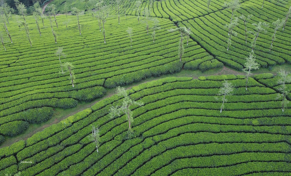
Leading lines are among the clearest ways to direct visual attention. Roads, fences, shorelines, shadows, architectural edges, rows of trees, and even the direction of a person’s gaze can lead the eye through an image.
The important point is that a line should lead somewhere meaningful. A winding road that begins in the foreground and reaches a small house gives the viewer a visual route and a destination. The same road may feel less effective if it exits the frame before reaching the intended subject.
Use lines to establish a visual journey
Wide-angle lenses can make foreground lines feel especially powerful because they exaggerate perspective. At 24mm or 28mm, a crack in pavement, a jetty, or a low wall can appear to rush from the bottom of the frame towards a distant subject. This can work beautifully in landscapes, travel photography, and environmental portraits.
But wide lenses also demand care. If the camera is too high, too far from the foreground, or pointed without a clear endpoint, the lines can become empty graphic shapes. Move closer, lower the camera, and make sure the line either supports the subject or contributes to the mood.
- Place a strong foreground line near a lower corner when you want it to pull the eye inward.
- Use converging lines to create depth in streets, interiors, and architecture.
- Watch for lines that point away from the subject or split the frame awkwardly.
- Remember that softer lines count too: a row of faces, repeated posts, or a sequence of highlights can create direction.
Not every line needs to be obvious. In a portrait, the angle of shoulders, a bent arm, and the subject’s gaze can form a subtle chain that leads viewers towards the face.
Gestalt principles explain why some frames feel organised
Gestalt psychology describes several ways people naturally group visual information. The terminology can sound academic, but the principles are immediately useful when arranging a photograph.
Proximity: elements close together feel connected
When two people stand close together in a frame, viewers tend to read them as a pair or a group. If they are separated by a large gap, the image may suggest distance, tension, or separate stories.
This can be used deliberately in documentary and street photography. A parent and child walking close together may communicate warmth and connection; placing them at opposite sides of a wide frame can make a crowded place feel emotionally isolating.
Similarity: repeated forms create rhythm
Objects with similar shapes, colours, or sizes are often read as a visual group. Repeated umbrellas in a market, windows on a building, or figures in matching uniforms create rhythm and pattern.
A single different object becomes more noticeable within that pattern. A red umbrella among black ones, for instance, may become the natural focal point without needing to sit in the centre of the frame.
Closure: the mind completes incomplete shapes
Viewers do not need to see every edge of a subject to understand it. A figure partly hidden by a doorway, a mountain disappearing into mist, or a face shown in profile can be more engaging than a fully revealed subject because the brain completes what is missing.
Closure is especially useful when simplifying a busy scene. Rather than showing an entire bicycle against clutter, frame a recognisable section—a wheel, handlebars, and a rider’s leg—if that crop tells the story more clearly.
Figure and ground: separate the subject from its background
Figure-ground separation is one of the foundations of readable photography composition. The “figure” is the element intended to stand out; the “ground” is everything behind or around it.
Separation can come from brightness, colour, focus, scale, or placement. A dark-coated subject against pale fog is easy to read. So is a sharply focused flower against a softly blurred background at a wide aperture. In a busy environment, simply shifting position a few steps can place the subject against a cleaner patch of wall or sky.
Colour directs attention before the viewer notices it
Colour theory is not only about making palettes look attractive. It is a practical way to control emphasis and mood.
Warm colours such as red, orange, and yellow often feel more visually assertive than cooler blues and greens, particularly when they appear in small amounts against a muted scene. A person in a red coat can become the anchor of a grey urban photograph. Conversely, a small cool-coloured subject may recede within a warm environment unless contrast, lighting, or placement helps it stand out.
Complementary colours—pairs positioned roughly opposite on the colour wheel, such as blue and orange—can create separation and energy. This relationship often appears naturally in dusk portraits, where warm artificial light falls on skin while the surrounding sky turns blue.
Colour contrast is not always the goal. A close palette of greens, greys, and soft blues can make a woodland image feel calm and cohesive. The key is consistency: decide whether colour should direct the eye, support atmosphere, or allow shape and light to take the lead.
Check the edges of the frame
Small patches of bright or saturated colour near the border can pull attention away from the main subject. Before shooting, scan the frame edge by edge. A cropped red car, a bright plastic bag, or a sliver of white sky may carry more visual force than expected.
This is often easier to diagnose by briefly viewing the image in black and white. Without colour, strong tonal distractions become more obvious. If the composition still reads clearly in monochrome, its underlying structure is usually sound.
Visual weight is the balance of attention
Visual weight describes how strongly an element pulls the eye. It is not the same as physical size. A small, bright object can outweigh a large, low-contrast area. A face usually carries considerable visual weight; so does a dark shape against a bright background, a sharply focused detail, or an isolated object in empty space.
Balance does not require symmetry. An off-centre subject can be balanced by a darker cloud, a distant building, negative space, or a second, quieter object on the opposite side of the frame.
Imagine a landscape with a lone tree placed on the right third. A large expanse of sky may balance it through negative space, while a subtle mountain on the left can stop the image from feeling as though it is tipping to one side. The goal is not mathematical equality. It is a frame that feels intentional.
Negative space gives attention room to work
Empty space is not wasted space. A plain wall, foggy sky, dark water, or out-of-focus background can isolate the subject and strengthen mood. It also slows the viewer down by removing competing information.
For portraits, leaving more space in the direction a person is looking often feels natural because it gives their gaze somewhere to travel. Breaking that convention can create tension—useful when the subject appears trapped, uneasy, or confronted by the edge of the frame.
Build the frame in the order the eye will read it
When a scene feels complicated, work from the largest decisions to the smallest. First identify the subject. Then look for the background, the brightest areas, the strongest lines, and any competing colours. Only after that should you worry about details such as the exact position of a hand or the amount of space above a head.
- Find the first point of attention. It may be a face, a silhouette, a bright object, or a distinctive shape.
- Decide how the eye reaches it. Use perspective, light, repeated forms, or surrounding space to create a path.
- Remove competing signals. Change your position, adjust the crop, wait for a distraction to move, or alter depth of field.
- Check the exit points. Notice where lines, gaze, and bright areas lead. Keep viewers inside the frame when possible.
The strongest compositional habit is simply pausing before the shutter. Look beyond the subject and read the whole frame as the viewer will. A photograph becomes more compelling when every important element has a job: to attract attention, direct it, balance it, or get out of the way.
That is the real craft behind composition. You are not merely arranging objects inside a rectangle. You are shaping the viewer’s experience, one visual decision at a time.