The Ultimate Guide to Color Space
Color space sounds technical, but it affects almost every photograph you edit, export, print, or post online. If you have ever seen a photo look rich and saturated in Lightroom, then dull on Instagram or strangely different on another screen, color space is probably part of the story.
The practical version is simple: a color space defines the range of colors a device or file can describe. Choosing the right one helps your photos stay consistent from camera to monitor, printer, and browser.
You do not need to memorize every profile in the industry. You just need a reliable workflow and a clear idea of when wider color is useful—and when it creates problems.
What a color space actually does
A digital image stores color as numbers. In an RGB image, those numbers describe mixtures of red, green, and blue light. But RGB values alone are not enough.
For example, a value of RGB 255, 0, 0 means “red,” but which red? That depends on the color space attached to the image. sRGB red, Adobe RGB red, and ProPhoto RGB red are not identical colors.
A color space provides the map that tells software and devices how to interpret those RGB numbers. Without that map, colors can shift because each app or display may make a different assumption.
Most photographers work with RGB color spaces, but you may also encounter CMYK for commercial printing and Lab color for advanced editing tools.
Color gamut: the range of colors available
The term gamut means the range of colors a color space can contain. Imagine each color space as a different-sized box. A small box can hold fewer colors; a larger box can hold more saturated or unusual colors.
This is especially noticeable in subjects with intense hues:
- Bright green spring foliage
- Deep turquoise water
- Neon signs at night
- Vivid flowers and painted walls
- Highly saturated fashion, product, and automotive photography
A wide-gamut color space can preserve more of those colors during editing. That does not automatically mean it is always the best choice. If the final destination cannot display or print those extra colors, they must be converted or compressed later.
The color spaces photographers use most
sRGB: the safe default for the web
sRGB is the most widely supported color space for websites, browsers, social platforms, inexpensive displays, and many consumer print services. It has a relatively modest gamut, but its compatibility is excellent.
If you are exporting a JPEG for a portfolio site, email, client gallery, Facebook, Instagram, or a general-purpose online store, sRGB is usually the correct choice.
Its main advantage is predictability. A properly tagged sRGB file is less likely to look washed out, overly saturated, or flat on someone else’s device.
Use sRGB for:
- Website images and blog posts
- Social media uploads
- Client proof galleries
- JPEGs sent to people who may use unknown software or screens
- Most lab exports when the lab specifically requests sRGB
Adobe RGB: useful for print-minded workflows
Adobe RGB (1998) has a wider gamut than sRGB, especially in greens and cyan-toned colors. It has long been popular with photographers who make inkjet prints or send files to professional print labs.
Adobe RGB can be a sensible working or delivery space when your printer, lab, and editing setup are color managed. For example, a landscape photograph containing bright moss, teal water, and blue-green mountain haze may retain more detail in those colors than it would in sRGB.
The catch is compatibility. If an Adobe RGB JPEG is uploaded to software that ignores its embedded profile, it may appear dull or desaturated. That is why Adobe RGB is not the safest web export choice.
ProPhoto RGB: maximum room, maximum responsibility
ProPhoto RGB is an extremely wide color space used by applications such as Lightroom Classic and Photoshop. It can describe colors beyond what most monitors and printers can reproduce.
That sounds odd at first, but it is useful during editing. Raw files can contain colors outside sRGB and Adobe RGB, and a wide working space reduces the risk of clipping those colors too early.
ProPhoto RGB is best treated as an editing space, not a casual sharing format. When using it in Photoshop, work in 16-bit whenever possible. A huge color space with only 8-bit data can make smooth gradients more vulnerable to banding or editing artifacts.
A practical approach is:
- Edit raw images in Lightroom or Adobe Camera Raw using its wide-gamut workflow.
- Send files to Photoshop as 16-bit ProPhoto RGB or the space your workflow specifies.
- Export a copy in sRGB for web use.
- Export or convert a separate file for a specific print process.
Display P3: common on modern screens
Display P3 is a wide-gamut color space used by many modern phones, tablets, laptops, and monitors. It can show more saturated colors than sRGB, particularly in red and green areas.
It is increasingly relevant for online viewing, but sRGB remains the most dependable standard for broad web delivery. If you publish Display P3 images, use a properly color-managed workflow and test the result. Older screens and apps may not show the extra gamut as intended.
Color space is not the same as bit depth
These terms often get mixed up, but they solve different problems.
Color space defines the range of colors available. Bit depth defines how many tonal steps are available within that range.
An 8-bit RGB file has 256 levels per channel. A 16-bit file has far more available levels, which is useful when making strong edits to skies, shadows, or smooth studio backgrounds.
Think of it this way:
- Color space: How large is the paint set?
- Bit depth: How many subtle shades can you mix from that paint set?
For everyday JPEG delivery, 8-bit sRGB is normal. For heavy retouching, compositing, or fine-art printing, 16-bit editing provides more safety.
Why photos change color between devices
A color-managed workflow depends on more than the file profile. Your display matters just as much.
If your monitor is too bright, you may edit images darker than they should be. If it has a cool blue cast, you may add too much warmth to compensate. If it is a wide-gamut monitor but not correctly profiled, saturated colors can be misleading.
Common causes of color mismatch include:
- Exporting without an embedded color profile
- Uploading Adobe RGB files to profile-unaware software
- Editing on an uncalibrated monitor
- Viewing a photo in an app with poor color management
- Comparing prints under dramatically different lighting
- Using a printer profile that does not match the paper and ink
Modern browsers generally handle embedded profiles well, but you should still export web JPEGs as sRGB. It avoids unnecessary surprises for your audience.
Monitor calibration and profiling
If color matters to your work, calibrating your display is one of the most useful upgrades you can make. A hardware calibration device measures your screen and creates an ICC profile that helps color-managed software display images accurately.
You do not need to obsess over perfection for casual photography. But if you sell prints, photograph products, deliver work to brands, or spend hours editing skin tones, calibration pays for itself in fewer corrections and fewer disappointing prints.
As a starting point, many photographers aim for a moderate monitor brightness rather than a screen that looks impressive in a bright showroom. Exact settings depend on your workspace and print goals, so follow the guidance from your calibration tool and printer workflow.
Soft proofing: check a print before you print it
Soft proofing simulates how an image may look when converted to a particular printer and paper profile. It cannot perfectly replace a physical proof, but it is extremely useful.
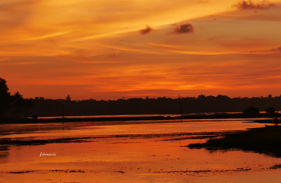
Suppose you have a sunset image with intense orange clouds and a deep blue foreground. Your monitor may display both beautifully, while a matte paper cannot reproduce the same saturation. Soft proofing can reveal where colors will clip or lose detail before you spend money on test prints.
When soft proofing, watch for:
- Overly saturated reds, oranges, greens, and blues
- Shadow detail becoming blocked up
- Bright areas losing separation
- Unexpected shifts in neutral grays or skin tones
Create a proof-specific edit if needed. Do not flatten your master file just to accommodate one paper type.
A simple color space workflow that works
For most photographers, this workflow is straightforward and reliable:
- Capture raw when possible. Raw files preserve more editing flexibility than JPEGs.
- Edit in a color-managed application such as Lightroom, Capture One, or Photoshop.
- Use a calibrated and profiled monitor if your work involves critical color.
- Keep a high-quality master file in your preferred editing workflow.
- Export sRGB JPEGs for the web, with the profile embedded.
- Prepare separate files for print according to the lab or printer’s requested profile.
- Soft proof important prints, especially fine-art work and large orders.
If your camera offers an sRGB or Adobe RGB setting, remember that it mainly affects JPEGs and previews. Raw captures are not permanently locked into either choice; you can choose an output color space later in your editing software.
Quick answers to common color space questions
Should I shoot in sRGB or Adobe RGB?
If you shoot JPEG and mostly share online, choose sRGB. If you shoot JPEG for a controlled print workflow and understand color management, Adobe RGB can be useful. If you shoot raw, the camera setting is less important because you choose the output color space during processing.
Should every photo be edited in ProPhoto RGB?
Not necessarily. Many photographers benefit from the wide-gamut internal workflows used by raw editors, but Photoshop files need sensible settings too. If you use ProPhoto RGB, 16-bit editing is the safer choice, and your final export should still match its destination.
Why does my print look darker than my screen?
Your monitor may be too bright, and a screen emits light while paper reflects it. Lower monitor brightness, use soft proofing, and assess prints under suitable viewing light.
Can I convert an sRGB photo to Adobe RGB for better color?
No. Converting to a larger color space does not create colors that were not present in the original file. It simply places the existing color data inside a larger container.
Color space is not about chasing the largest possible gamut. It is about keeping control of your image from the first edit to the final viewer. Use wide-gamut tools when they protect your options, use sRGB when compatibility matters, and let the final destination guide the export.
The next time a photo looks different after upload or print, do not just tweak the saturation and hope for the best—check the profile, the display, and the destination. What color space does your current workflow use, and is it actually matched to where your photos end up?