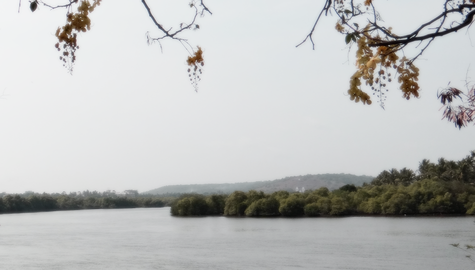
Make Your Digital Photo Look Like Film
A convincing film look is not a preset slapped over a clean digital file. It is a collection of small choices: softer contrast, restrained color, imperfect grain, gentle highlight roll-off, and an edit that supports the mood of the photograph.
The good news is that modern digital cameras give you an excellent starting point. You can keep the sharpness, exposure latitude, and flexibility of a RAW file while borrowing the visual character many people love about film photography.
Start with a solid image, then build the look with intention. A street portrait in flat afternoon light, a foggy landscape, or a warmly lit kitchen scene will usually respond better than an image that is badly exposed or cluttered with distracting elements.
Know What You Mean by a Film Look
Film is not one single style. Different film stocks and formats produce very different results. Some are punchy and saturated, while others are muted, grainy, soft, or cool in the shadows.
Before editing, decide which direction fits the image. This prevents the common mistake of adding faded blacks, orange skin, teal shadows, heavy grain, and a vignette all at once.
- Classic color negative look: soft contrast, warm skin tones, gentle highlights, visible but subtle grain.
- Vintage print look: faded blacks, lower saturation, slight color shift, and less crisp detail.
- Slide film-inspired look: stronger color, deeper blacks, richer blues or greens, and more dramatic contrast.
- Black-and-white film look: thoughtful tonal separation, visible grain, softer digital sharpness, and controlled highlights.
Save a few reference images that match the mood you want. Do not try to copy every color exactly. Use them to guide contrast, saturation, color balance, and grain.
Start With Exposure and White Balance
Film-inspired editing works best when the base file feels natural. Open your RAW image in Lightroom, Adobe Camera Raw, Capture One, or another editor that lets you control tones and color precisely.
Expose for protected highlights
Digital highlights can look harsh when they clip. Film often handles bright areas with a smoother transition, especially color negative film. To imitate that feeling, keep important bright areas under control from the start.
Lower highlights until bright skies, white shirts, windows, or pale walls regain detail. Then raise exposure or shadows only as much as needed. Avoid making every shadow equally visible. A little depth helps the image feel less processed.
Set white balance before grading
Correct white balance is your foundation. If skin looks green or a white wall looks noticeably blue, creative color grading will become harder.
Once the image looks believable, shift the temperature slightly toward the mood you want. A family photo at sunset can take a little warmth. A rainy city scene may benefit from a cooler overall balance with warmer highlights. Keep the move small. Extreme white balance shifts often look more like an Instagram filter than film.
Shape Contrast With Curves
Contrast is one of the fastest ways to move a digital image away from the default camera look. Digital files can have very clean blacks and abrupt bright highlights. Film often feels gentler at both ends of the tonal range.
Lift the black point carefully
In the tone curve, raise the bottom-left point slightly. This turns pure black into a dark gray and creates the faded shadow detail associated with some scanned prints.
Use restraint. If the black point is lifted too far, the image loses weight and every dark object becomes washed out. A moody portrait still needs deep tones around hair, clothing, or the background.
Soften the brightest values
Pull the top-right section of the curve down a touch, or reduce highlights with the basic panel. The goal is not to make whites gray. It is to keep bright tones from looking brittle.
A gentle S-curve can still work well. Add modest contrast through midtones, lift the deepest blacks slightly, and compress the brightest highlights. This creates a softer, more print-like tonal roll-off.
Use Color With a Light Hand
Color is where many film edits go wrong. Oversaturated greens, orange skin, and aggressive teal shadows may look dramatic at first, but they rarely stay convincing when you revisit the photo later.
A better approach is to adjust individual color ranges rather than pushing global saturation.
- Reduce green saturation slightly in foliage-heavy scenes.
- Shift yellow-green foliage a little toward yellow for a warmer late-summer feel.
- Lower blue luminance in skies when you want a denser, more dramatic blue.
- Keep orange adjustments subtle so skin remains believable.
- Use vibrance before saturation when the image only needs a small color lift.
Try split toning or color grading
Many film looks have small color differences between shadows and highlights. You might add a faint cool tint to shadows and a soft warm tint to highlights. Another option is a slightly green shadow tone paired with warm skin and sunlit areas.
The keyword is faint. If viewers can immediately identify the shadow color effect, it is probably too strong. Color grading should feel like atmosphere, not decoration.
Add Grain That Belongs in the Image
Film grain is not the same as digital noise. Digital noise often appears as random color speckles, especially in underexposed areas. Film grain usually has a more organic, textured appearance that affects the image as a whole.
Most editing software includes a grain tool with controls for amount, size, and roughness. Start lower than you think you need.
- Add a small amount of grain while viewing the entire image.
- Zoom to 100 percent and check whether it looks natural in smooth areas such as skies and skin.
- Increase grain size gradually if you want a more obvious film scan character.
- Reduce the effect if shadows become dirty or faces begin to look gritty.
Grain generally works best after you have finished exposure, color, and sharpening. It should unify the final image, not hide editing problems.
Reduce the Ultra-Clean Digital Edge
Modern lenses and cameras can produce extremely crisp files. That is useful, but it can clash with a softer film-inspired edit. You do not need to make the photo blurry. You simply need to remove the overly polished edge when it distracts from the mood.
Back off sharpening
If you are working from a RAW file, reduce sharpening slightly from the default setting. Pay particular attention to portraits, where too much sharpening can exaggerate pores, stray hairs, and fabric texture.
Use masking if your software offers it. Sharpen important edges such as eyes, eyelashes, or architectural lines while leaving smooth skin and open skies alone.
Consider a subtle vignette
A slight vignette can guide attention toward a subject, especially in portraits and quiet still-life images. Keep it gentle and centered naturally around the frame. A heavy black circle at the edges looks artificial fast.
For more control, use a radial mask instead of a global vignette. You can darken a bright corner, soften a distracting edge, or lift the subject slightly without making the treatment obvious.
Match the Edit to the Photograph
The same preset will not suit every image. A clean seaside scene may need cool shadows and restrained blues. A café portrait might work better with warm highlights, softer blacks, and medium grain. A nighttime street image can tolerate stronger grain and deeper color shifts because the scene already has atmosphere.
Ask a practical question as you edit: what should the viewer feel first? If the answer is quiet, nostalgic, intimate, or documentary-like, each adjustment should support that answer.
Also consider the final output. Photos intended for a small phone screen can handle a little more contrast than a large print. Grain that looks perfect online may become distracting when printed at A3 or larger. Export a test file and look at it outside your editing window before committing.
A Simple Film-Inspired Editing Workflow
If you want a repeatable process, use this order. It keeps the edit organized and makes it easier to spot when one adjustment has gone too far.
- Choose a well-exposed RAW image with a clear subject.
- Correct white balance and basic exposure.
- Recover bright highlights while keeping some shadow depth.
- Use the tone curve to soften blacks and highlights.
- Adjust individual colors, especially greens, blues, yellows, and skin tones.
- Add subtle shadow and highlight color grading.
- Reduce excessive sharpening or texture where needed.
- Add grain and, if appropriate, a soft vignette.
- Step away for a few minutes, then review the image with fresh eyes.
That final pause matters. Film looks are easy to overcook when you stare at an image for too long. If the edit feels obvious before you even compare it to the original, dial back one or two effects.
Build Presets From Your Own Edits
Once you create an edit you genuinely like, save it as a preset. Include the tone curve, color mix, color grading, grain, and sharpening settings, but leave exposure and white balance unchecked. Those two settings usually need to be tailored to each photograph.
Think of presets as starting points, not finished recipes. A preset can give a project visual consistency, but every image still needs individual attention. The best film-inspired galleries share a mood without making every frame look mechanically identical.
The most satisfying film look is rarely the one with the most effects. It is the edit that makes a digital photograph feel considered, tactile, and emotionally right for the moment. Try the workflow on three very different photos, compare the results, and see which choices still feel good a day later. What kind of film mood fits your own photographs best?