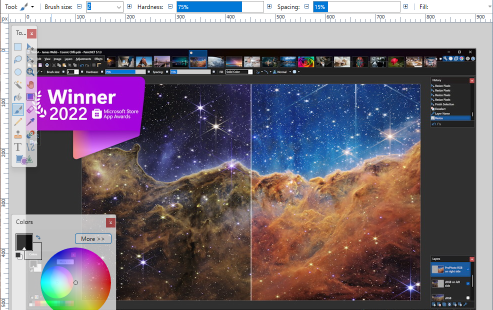
The Ultimate Guide to Paint.NET
Paint.NET is one of those photo editors that earns a permanent spot on a Windows PC. It is lighter and easier to learn than many professional editing suites, yet it gives photographers far more control than a basic crop-and-filter app. For everyday image work, from cleaning up a holiday photo to preparing a sharp JPEG for your portfolio, it is a practical tool.
This guide covers the Paint.NET workflow that matters most for digital photo editing: getting set up, making safe corrections, working with selections and layers, using effects with restraint, and exporting images that look good outside the editor.
What Paint.NET does well
Paint.NET is a Windows-based raster image editor. It works best with pixel-based photographs, scanned prints, web graphics, screenshots, and simple image composites. Its interface is approachable, but it includes features that are genuinely useful once you move beyond basic edits.
- Layers for combining photos, text, and adjustments without flattening everything immediately.
- Selection tools for editing only a subject, sky, background, or small distracting area.
- Adjustment tools for brightness, contrast, curves, hue, saturation, and black-and-white conversions.
- Effects for sharpening, noise reduction, blur, vignettes, and creative treatments.
- Plugin support that expands the available tools considerably.
- History panel for stepping backward through edits when an experiment goes wrong.
It is not designed to replace a dedicated RAW processor. If you regularly photograph in RAW, use a RAW-capable application first to recover highlights, set white balance, and make major exposure decisions. Paint.NET is especially useful after that stage, when you need retouching, local edits, resizing, compositing, or export preparation.
Set up a sensible editing workspace
Open a photo with File > Open. Before touching any sliders, look at the image at two magnifications: fit-to-window for overall composition, then 100 percent for sharpness, noise, dust, and small distractions.
Paint.NET displays important panels around the canvas. If something is missing, check the Window menu. For photo work, keep these panels visible:
- Layers to control stacked image elements.
- History to review and undo your sequence of changes.
- Tools for quick access to selections, brushes, clone stamp, text, and shapes.
- Colors when painting, retouching, or adding a border.
Start every meaningful edit by saving a working copy. Paint.NET uses the .pdn format to preserve layers and editability. Save this master file first, then export a JPEG, PNG, or other delivery format later.
Create a non-destructive starting point
Paint.NET does not offer adjustment layers in the same way as some advanced editors, but you can still work carefully. Duplicate your photo layer before applying a major effect or retouching pass. Select the layer in the Layers panel and use the duplicate command.
This gives you a fallback version inside the same file. You can also lower the top layer opacity to soften an effect, or hide it temporarily to compare your edited version against the original.
Build a reliable photo editing order
A good order prevents you from polishing details that may disappear after a crop or exposure correction. For most photographs, use this sequence:
- Crop and straighten the composition.
- Correct exposure and color balance.
- Make local fixes with selections or retouching tools.
- Apply noise reduction if needed.
- Sharpen near the end.
- Resize and export for the final destination.
You do not need every step for every image. A well-exposed portrait may need only a crop, a small color correction, and light sharpening. A dim indoor photo may need more work, but aggressive editing can quickly make it look artificial.
Crop, straighten, and improve composition
Use the Rectangle Select tool to define the area you want to keep. Once the selection is active, use the crop command to remove the outer area. For web images, crop first and resize later.
When a horizon is visibly tilted, rotate the image before cropping. A small correction can make a seaside image or architectural photograph feel immediately more deliberate. Be careful not to overcorrect based on a shoreline that was naturally uneven; use a genuinely level reference such as a building edge, lake horizon, or table surface.
Use aspect ratios with a purpose
Choose a crop based on where the image will appear. A wide crop suits a website banner. A square crop works well for many social posts. A vertical crop can strengthen a portrait by removing empty space around the subject.
- 3:2 keeps the familiar shape from many cameras.
- 4:5 is useful for vertical social sharing.
- 1:1 creates a square frame with a graphic feel.
- 16:9 works for headers, slides, and wide landscapes.
Do not crop just because an image can be cropped. Leave breathing room when it supports the story, especially around a person looking into the frame.
Correct brightness, contrast, and colour
Paint.NET places its core photo controls under the Adjustments menu. Start gently. Small corrections often look more convincing than a dramatic slider move.
Brightness and contrast
Brightness shifts the overall lightness of the photo. Contrast increases or reduces the separation between dark and light tones. If a cloudy landscape looks flat, a modest contrast increase may restore depth. If a portrait has harsh midday shadows, lowering contrast slightly can make skin look less severe.
Watch the brightest parts of the frame. A white shirt or bright sky can lose texture if brightness is pushed too far. Likewise, deep shadows can turn into featureless black if contrast becomes excessive.
Curves for more controlled edits
The Curves adjustment is worth learning because it gives you control over different tonal ranges. A subtle S-shaped curve often adds depth: lower the shadow area a little and raise the highlight area a little.
For a faded, matte look, lift the darkest point slightly rather than simply raising overall brightness. This preserves a more intentional result. Make small changes, then toggle the preview on and off to check whether the edit improves the image or merely makes it more dramatic.
Hue, saturation, and white balance
Use Hue/Saturation carefully. A small saturation boost can revive a muted image, but over-saturated greens, orange skin, and neon blue skies are common warning signs.
If an indoor photo has a strong yellow or blue cast, try the available colour adjustment controls before increasing saturation. Correcting the cast first usually gives better colour than trying to overpower it with more intensity.
A practical example: if a café portrait looks too warm under tungsten lighting, reduce the yellow-orange cast slightly. Then check skin tones and the whites of plates, napkins, or walls. Neutral objects are often better guides than your memory of the scene.
Make local corrections with selections and layers
Global adjustments affect every pixel. That is fine for an overall exposure issue, but it is not ideal when only one part of the image needs attention. This is where Paint.NET selections become useful.
Use the Lasso Select tool for irregular shapes and the Magic Wand for areas with similar colour or brightness. A sky against a dark mountain range is often a good candidate for Magic Wand selection, though you may need to adjust tolerance and add or subtract from the selection.
Once selected, copy the area to a new layer. You can then brighten the sky, soften a background, or adjust a colourful object without changing the rest of the image.
Feather edges when needed
A hard selection edge can create an obvious halo after an adjustment. If you brighten a face or darken a sky, soften the transition around the selected area where possible. The goal is for the correction to disappear into the photograph rather than announce itself.
Zoom in and inspect edges around hair, glasses, branches, and buildings. These are the places where rushed selections are easiest to spot.
Retouch distractions without overdoing it
The Clone Stamp tool is Paint.NET’s main tool for removing small distractions. It samples pixels from one area and paints them over another. Use it for sensor dust in a plain sky, a small blemish, a stray sign in the background, or an unwanted cable crossing an otherwise clean wall.
Choose a source area close to the object you are removing so the texture and lighting match. Use a soft brush for skin and gradual backgrounds. For detailed edges, use a smaller brush and work in short strokes.
- Remove temporary distractions, not permanent identifying features, unless the edit has a clear purpose.
- Change the clone source often to avoid repeated patterns.
- Zoom out regularly. A perfect edit at 400 percent can look strange at normal viewing size.
- Keep texture in skin. Heavy retouching often replaces a human face with a plastic surface.
Use effects as finishing tools
Paint.NET includes effects for blur, sharpen, noise, distortions, and stylised looks. They are useful, but photo editing usually benefits from restraint.
Noise reduction before sharpening
High-ISO photos and underexposed images can show visible digital noise, especially in shadows. Apply noise reduction before sharpening. If you sharpen first, you may sharpen the noise as well as the real detail.
Do not expect noise reduction to create detail that was never captured. Its job is to reduce distraction while preserving important texture. Check hair, fabric, leaves, and fine architectural lines before committing.
Sharpen for the output size
Sharpening should be one of the last steps, and it should match the final image size. A photo that looks right at full resolution may need a small extra sharpen after it is resized for the web.
Look for halos along high-contrast edges, such as dark tree branches against a bright sky. If you can easily see a pale outline, reduce the sharpening amount. Good sharpening adds clarity without making the process visible.
Install plugins carefully
Paint.NET has a strong plugin community, and plugins can add tools for frames, colour effects, selections, file formats, and more advanced retouching. They can be useful when you repeatedly need a feature that is not built in.
Keep your setup manageable. Install plugins from reputable sources, read their compatibility notes, and test them on duplicate files. A large collection of effects may sound appealing, but a small set of reliable tools is easier to learn and faster to use.
For photographers, the most useful additions are usually practical rather than flashy: enhanced selection tools, useful file support, vignette controls, and targeted colour adjustments.
Resize and export without ruining the photo
When your edit is complete, save the layered .pdn file again. Then use Save As to create the final image file.
Choose the format according to the job:
- JPEG for photographs shared online, emailed, or uploaded to a portfolio. It creates compact files but uses compression.
- PNG for graphics, screenshots, images with transparency, or photographs where file size is less important.
- TIFF when you need a high-quality file for a print workflow that supports it.
For a web image, resize to the actual maximum display width rather than uploading a huge camera original. A 6000-pixel-wide image is unnecessary for a gallery slot that displays at 1600 pixels. Smaller files load faster and are easier for readers to view on mobile connections.
When saving a JPEG, inspect the preview if available and choose a quality level that keeps fine details intact without producing an oversized file. Check smooth areas such as skies and walls for blocky compression artifacts.
A simple Paint.NET workflow to practise
Pick one ordinary photo instead of your absolute favourite and run through this short exercise:
- Save a .pdn master copy.
- Crop out one distraction at the edge of the frame.
- Use Curves to make a subtle tonal correction.
- Reduce an unwanted colour cast.
- Clone out one small blemish or sensor spot.
- Apply modest sharpening at 100 percent view.
- Export a web-sized JPEG and compare it with the original.
The point is not to create a heavily edited image. It is to learn which adjustments genuinely support the photograph. Paint.NET is at its best when it helps your eye lead the editing, rather than tempting you to apply every available effect.
Try this workflow on three different subjects this week: a portrait, a landscape, and an indoor scene. You may find that the most satisfying edit is not the one with the biggest change, but the one where viewers notice the photograph before they notice the processing. What is the one editing habit you would most like to improve next?