Adobe Lightroom for Photographers
Adobe Lightroom can turn a crowded memory card into a finished set of photographs, but its many panels and sliders can feel overwhelming at first. The key is to treat Lightroom as a workflow rather than a collection of effects: import carefully, choose your strongest frames, make adjustments in a sensible order, and export files for their intended use.
This practical Adobe Lightroom tutorial focuses on the parts photographers use most: organising images, correcting exposure and colour, applying local adjustments, and preparing files for print or the web. The names and layout can vary slightly between Lightroom Classic and the cloud-based Lightroom, but the principles are broadly the same.
Choose the right Lightroom workspace
Adobe offers two main versions. Lightroom Classic stores your original photos in folders on your computer or connected drives and uses a catalogue to track edits and organisation. Lightroom is designed around cloud storage and synchronisation, with photos managed through Adobe’s online ecosystem.
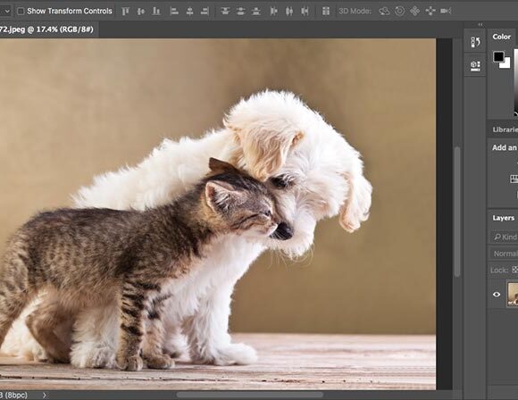
Both versions use non-destructive editing. Lightroom does not permanently alter your original photograph when you adjust exposure, crop an image, or convert it to black and white. Instead, it records the changes so you can revisit them later. This makes it safe to experiment, although you should still maintain a reliable backup of your original files.
Import and organise your photographs
Before editing, create an organisation system that you can maintain. A simple folder structure based on date and shoot is usually more useful than a complicated hierarchy based on subject, camera, or lens.
When importing into Lightroom Classic, you can copy photographs from a memory card to a chosen folder, add them to the catalogue, and apply basic metadata at the same time. Avoid editing directly from a memory card. Copy the files to a working drive first, then eject the card only after the transfer is complete.
Useful information to add during import includes:
- A consistent copyright or creator name in the metadata.
- A brief description of the shoot or location.
- Keywords such as “coast,” “portrait,” “blue hour,” or “wildlife.”
- A standard develop preset for lens corrections or a preferred starting point.
Do not add dozens of keywords to every image. A small set that helps you find photographs later is more practical. Collections, albums, or folders for projects can then group images without moving the original files on your drive.
Cull before you edit
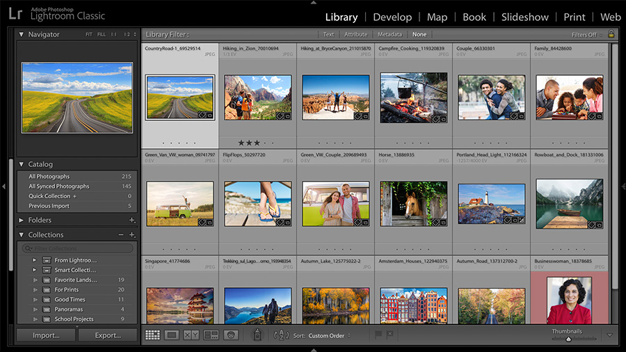
One of the biggest Lightroom time-savers is to select photographs before making detailed adjustments. Open the Library or grid view and remove obvious failures first: missed focus, accidental frames, severe motion blur, closed eyes, and near-identical duplicates.
Use a simple rating system. For example, you might mark technically sound images as picks, give your best photographs a star rating, and leave unselected frames unrated. Colour labels can also identify images that need retouching, exporting, printing, or delivery.
When comparing similar frames, look closely at the subject’s expression, focus point, gesture, and background—not just the thumbnail. A photograph that looks slightly less dramatic at first glance may have better timing or cleaner composition.
Start in the Develop module
Once you have selected the keepers, move to the Develop module in Lightroom Classic, or the Edit view in Lightroom. Begin with global adjustments: changes that affect the entire frame.
Correct the profile, white balance, and exposure
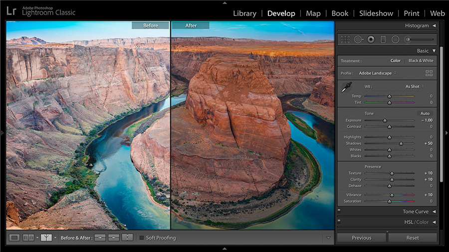
The Profile setting controls the basic rendering of the raw file. Adobe’s default profile is a sensible starting point, while profiles designed for portraits, landscapes, or monochrome work can create a different foundation. Choose the profile before fine-tuning the sliders, because it can change the image’s overall appearance.
Next, correct white balance. Temperature controls the image from cool blue to warm yellow, while Tint adjusts the balance between green and magenta. If a white or neutral object is visible, the White Balance Selector can provide a useful starting point. For sunset photographs, snow scenes, or images lit by mixed sources, there may not be one objectively correct setting. Choose the colour that supports the mood and remains believable.
Adjust exposure until the photograph has a convincing overall brightness. Then use the histogram as a guide. The histogram shows how tones are distributed from shadows on the left to highlights on the right. It is not a recipe for a particular shape, but it can reveal clipped tones that are pure black or pure white with no recoverable detail.
Shape contrast with the basic tone controls
Highlights and Shadows are often more useful than simply increasing Contrast. Lowering Highlights can recover detail in bright clouds or a pale wedding dress, while raising Shadows can reveal information beneath a hat or in a backlit foreground.
Use Whites and Blacks to set the brightest and darkest points. Hold the appropriate modifier key while dragging these controls to view clipping warnings, depending on your Lightroom version and operating system. A small amount of clipping can be intentional—for example, a bright sun in a landscape—but unwanted clipping on important detail should usually be avoided.
The Contrast slider changes the separation between light and dark tones across the image. Use it cautiously. Too much contrast can make skin harsh and remove texture from shadows.
Improve colour without making it artificial
Vibrance and Saturation both increase colour intensity, but they do so differently. Vibrance generally applies a more restrained adjustment, making it a useful first choice when an image looks slightly flat. Saturation affects all colours more directly and can quickly produce unnatural skin tones or intense skies.
The Color Mixer, sometimes called HSL, gives you more precise control over individual colour ranges. It can be useful when a green landscape looks too yellow, when blue skies need refinement, or when an orange jacket distracts from a portrait subject. Adjust Hue, Saturation, and Luminance in small amounts and check the entire image after each change.
For black-and-white work, use the Black & White treatment and then control how different original colours translate into grey tones. Increasing the brightness of oranges can lighten skin, while darkening blues can add weight to a sky. The effect depends on the colours present in the original photograph.
Use the Tone Curve for controlled contrast
The Tone Curve provides more precise control than the basic Contrast slider. A gentle S-curve—slightly lowering darker tones and raising lighter tones—can add contrast while preserving the overall exposure.
Keep the curve subtle at first. A strong curve may look impressive at a small preview size but can create blocked shadows and brittle highlights. You can also use the parametric curve controls to adjust shadows, darks, lights, and highlights without placing individual points.
Apply local adjustments with masks
Global corrections cannot solve every problem. Lightroom’s masking tools let you adjust selected areas rather than the entire image. You can brush over a subject, select the sky, choose a linear gradient, or use automatic subject and background selections where available.
For a backlit portrait, a mask over the person can lift exposure and open the shadows while leaving the bright sky unchanged. For a landscape, a graduated mask over the sky can reduce highlights and add contrast without darkening the foreground. A radial mask can subtly draw attention towards a subject by brightening or darkening the area around it.
Feather the mask edges so the adjustment blends naturally. If the selection is not accurate, use Add and Subtract controls to refine it. Zoom out regularly: an adjustment that looks invisible at 100 percent may become obvious when viewing the whole photograph.
Finish with detail and lens corrections
Use the Detail panel to sharpen images carefully. Sharpening improves the appearance of edges, but it cannot repair an out-of-focus photograph. The Amount, Radius, Detail, and Masking controls work together, so inspect the image at 100 percent while adjusting them.
Noise reduction can help with photographs made at high ISO settings or underexposed frames that have been brightened. Excessive luminance noise reduction can remove fine texture, especially in hair, foliage, and fabric. Apply only as much as the image needs.
Enable lens profile corrections when Lightroom recognises the lens and you want to correct distortion or vignetting. Chromatic aberration—coloured fringes along high-contrast edges—can often be reduced with the corresponding correction option. These tools are useful, but they are not mandatory for every photograph; some vignetting may be part of the desired look.
Crop and straighten with purpose
Crop after you have established the main tonal and colour adjustments, unless the original framing makes it difficult to judge the image. Straighten horizons and architectural lines, then choose an aspect ratio suited to the final use.
A 3:2 crop may preserve the camera’s native proportions, while 4:5 can suit a vertical social-media presentation and a square crop can create a more graphic composition. Keep an eye on important limbs, hands, and objects near the edges. If the image will be printed, leave enough flexibility for the printer’s required dimensions.
Copy a consistent look across a set
For a series made in the same light, edit one representative frame first. You can then synchronise selected settings or copy and paste adjustments to other images. Apply this carefully: exposure and white balance may vary between frames even when the location is unchanged.
Presets are useful starting points, not finished edits. After applying one, check exposure, skin tones, highlights, and shadows for each photograph. A preset designed for a softly lit portrait may look heavy on a bright outdoor frame.
Export the finished files
Export settings should match the destination. For online galleries and general sharing, JPEG is usually practical, with the colour space selected according to the requirements of the service or publication. For printing, ask the lab or publication which file type, colour space, dimensions, and sharpening settings they prefer.
Choose the pixel dimensions carefully. A full-resolution export is appropriate when the recipient may need to crop or print the image, while a smaller version is more efficient for email or web use. Rename files during export if a clear project-based naming system will make delivery easier.
Keep your original raw files and Lightroom catalogue or cloud originals backed up separately. Lightroom’s non-destructive editing is powerful, but it does not replace a backup strategy. With a consistent process, the software becomes less about chasing dramatic effects and more about making strong photographs easier to find, refine, and share.