The Ultimate Guide to White Balance
White balance is one of those camera settings that seems minor until a perfectly good photo comes back looking orange, blue, or strangely green. Get it right, and whites look white, skin tones look believable, and the mood of the light feels intentional. Get it wrong, and even a sharp, well-exposed image can feel off.
The good news: white balance is not difficult once you understand what your camera is trying to correct. Whether you shoot JPEGs on a phone, RAW files on a mirrorless camera, or a mix of both, this guide will help you make better decisions in the field and fix problems when needed.
What white balance actually does
Different light sources have different color casts. Midday sun tends to be fairly neutral, shade is often blue, household tungsten bulbs are warm orange, and some fluorescent or LED lights can add green or magenta.
Your eyes constantly adjust to these shifts. A white sheet of paper still looks white to you under a desk lamp or beside a window. Cameras need help making that same adjustment.
White balance tells the camera what should be neutral—usually white, gray, or a naturally colorless part of the scene. The camera then shifts the other colors to compensate for the color of the light.
If your image looks too warm, it has too much yellow or orange. If it looks too cool, it has too much blue. White balance is the control that brings those colors back into balance—or pushes them further for creative effect.
Color temperature: the Kelvin scale made simple
White balance is commonly measured in Kelvin (K). This can feel backward at first:
- Lower Kelvin values add blue and cool the image down.
- Higher Kelvin values add orange and warm the image up.
That means a low color-temperature light source, such as a warm tungsten bulb, often requires a higher Kelvin setting in the camera to neutralize its orange cast.
Useful Kelvin starting points
- 2,500–3,200K: very warm indoor bulbs, candlelight, some stage lighting
- 3,200–4,000K: warm mixed indoor light
- 4,500–5,500K: daylight, direct sun, many flash setups
- 5,500–6,500K: overcast skies and open shade
- 6,500–8,000K: deep shade, blue hour, very cool ambient light
These are starting points, not rules. The same “daylight” can look different depending on cloud cover, reflected color from nearby buildings, and the time of day.
Auto White Balance: when to trust it
Auto White Balance (AWB) is remarkably capable on modern cameras and phones. For casual shooting, travel photography, and fast-moving situations, it is often the sensible choice.
AWB works best when the scene contains a variety of colors and a fairly obvious neutral reference. A street scene in normal daylight, a family gathering near a window, or a landscape with sky, foliage, and buildings are all situations where it usually performs well.
It can struggle when the scene is dominated by one color or lit by unusual light. Think of a red concert stage, a sunset, a snowy field at dusk, or a room lit with mixed LED bulbs and window light.
Use AWB when:
- You are moving quickly and light changes constantly.
- You shoot RAW and are comfortable adjusting color later.
- The lighting is relatively normal and consistent.
- You are photographing candid moments where timing matters more than perfection.
Switch away from AWB when:
- You need consistent color across a series of images.
- You are shooting a panorama, timelapse, or product set.
- The camera keeps changing the color from frame to frame.
- You are under mixed, colored, or strongly artificial lighting.
Understanding white balance presets
Most cameras offer presets such as Daylight, Cloudy, Shade, Tungsten, Fluorescent, Flash, and sometimes several LED options. They are quick shortcuts based on common lighting conditions.
Here is how they work in practice:
- Daylight: A reliable baseline for outdoor sun. It also keeps a series of images consistent instead of letting AWB shift from shot to shot.
- Cloudy: Adds warmth to counter the cool light of an overcast day. It can make portraits outdoors feel healthier.
- Shade: Adds even more warmth. Useful under a blue sky, especially when your subject is in open shade.
- Tungsten/Incandescent: Adds blue to correct the orange cast of traditional household bulbs.
- Fluorescent: Corrects some cool or greenish fluorescent lighting, though results vary widely by fixture.
- Flash: Suits the generally daylight-balanced color of most standard flashes.
Presets are not magic. A “tungsten” setting may be wrong for a modern warm LED bulb, and fluorescent presets cannot perfectly handle every office ceiling light. Still, they are a fast and useful starting point.
Custom white balance: the most accurate option
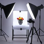
When color needs to be dependable, use a custom white balance. This is especially useful for product photography, food photography, real estate work, studio portraits, and any job where accurate color matters.
The usual method is simple: photograph a neutral gray card or white balance target under the same light falling on your subject, then tell the camera to use that frame as its reference.
A practical custom white balance workflow
- Place a gray card where your subject will be.
- Make sure it receives the same light as the subject.
- Fill enough of the frame with the card and take a reference photo.
- Use your camera’s custom white balance menu to select that image, or set a manual Kelvin value after checking the result.
- Re-check if the light changes, such as when clouds move in or you switch on a lamp.
A proper gray card is better than guessing from a white wall, shirt, or paper sheet. Those objects may contain dyes, optical brighteners, or color casts that are invisible to your eye but visible to the camera.
White balance and RAW versus JPEG
Your file format changes how carefully you need to set white balance in camera.
With RAW files, the white balance setting is recorded as editing information rather than permanently baked into the pixels. You can adjust it later in Lightroom, Capture One, Adobe Camera Raw, or similar software with little penalty.
With JPEG files, white balance is applied during processing in the camera. You can still edit it, but large corrections can reduce image quality and make skin tones or shadows look less natural.
If you shoot JPEG for speed or delivery, spend more time getting white balance right before pressing the shutter. If you shoot RAW, treat in-camera white balance as a strong preview and a way to keep your editing workflow efficient.
How to correct white balance in editing
Even careful photographers adjust white balance after the shoot. The key is to correct color without stripping the scene of its atmosphere.
Start with a neutral reference
Use your editing software’s white balance eyedropper on an area that should be neutral gray, white, or black. A gray pavement area, white shirt, or neutral wall can work if it is not reflecting strong color from its surroundings.
Then inspect the whole image. A technically neutral result is not always the most pleasing one. Portrait skin is often the best final test.
Adjust temperature and tint separately
Most editors give you two key controls:
- Temperature: moves the image between blue and yellow/orange.
- Tint: moves the image between green and magenta.
Temperature fixes the obvious warm-or-cool problem. Tint fixes the more subtle issue often caused by fluorescent lights, cheap LEDs, or reflected greenery. If a portrait looks slightly sickly after correcting temperature, move the tint gently toward magenta.
Mixed lighting: the white balance problem you cannot fully solve
A room with warm lamps, cool window light, and colored LED accent lighting has no single perfect white balance. Correcting the lamps may make the window light blue. Correcting the window may turn the lamps orange.
In these scenes, decide what matters most. For a portrait by a window, balance for the person’s face and let the background lamps stay warm. For an interior photo where the lamps are part of the atmosphere, preserve some warmth rather than neutralizing everything.
You can also control the problem while shooting:
- Turn off competing light sources where possible.
- Move your subject closer to one dominant source.
- Use curtains to reduce window light.
- Add a gel to your flash so its color matches the room lighting.
- Use local adjustment masks in editing for separate parts of the image.
Creative white balance: accurate is not always better
White balance is also a mood control. A slightly warmer setting can make a beach portrait feel sun-soaked. A cooler setting can make a rainy city scene feel lonely and cinematic. The important part is that the choice looks deliberate.
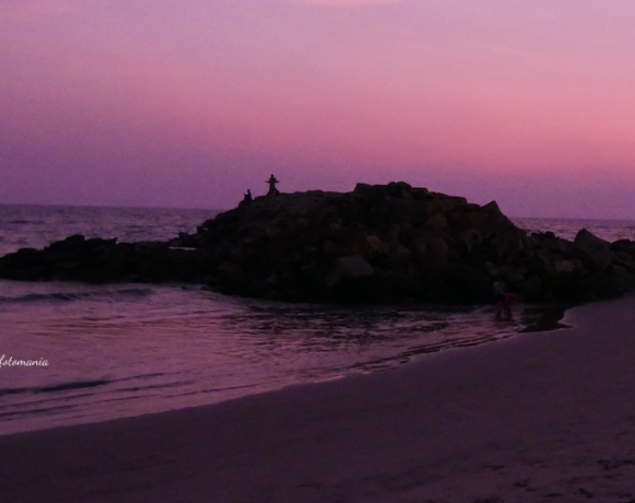
For sunsets, try the Daylight preset instead of AWB. Auto White Balance often removes some of the rich orange and pink tones that made you stop and take the photo in the first place. For blue hour, avoid over-warming the scene just because a neutral wall looks blue; that blue may be the point.
For portraits, be more restrained. Strong creative color can be effective, but unnatural skin tones are distracting unless the image is clearly stylized.
A quick white balance checklist before you shoot
- Look at the main light source, not just the location.
- Ask whether the scene is lit by one color of light or several.
- Use AWB for changing conditions and manual settings for consistency.
- Choose a fixed preset for panoramas, timelapses, and product series.
- Use a gray card when color accuracy matters.
- Shoot RAW when possible, especially in difficult lighting.
- Preserve warmth or coolness when it supports the mood of the scene.
White balance is not merely a technical correction. It is your decision about what the light should feel like. Next time a scene looks “almost right” but not quite, check the color before changing anything else—and try one intentional white balance adjustment. You may be surprised how much the photograph comes alive. What lighting situation gives you the most trouble? Take a few test frames this week and compare AWB, a preset, and a manual Kelvin setting.